Introduction

How To Customize Button Widgets? Customizing button widgets is a very tiring task, you have to keep going back and forth between multiple tutorials but none of them seem to work? That has to do with the fact that Flutter’s code structuring is very messy because of the nesting and furthermore the issue of some components being rendered obsolete or deprecated. Today we will learn how to customize two button widgets namely ElevatedButton and OutlinedButton.
How To Customize Widgets?
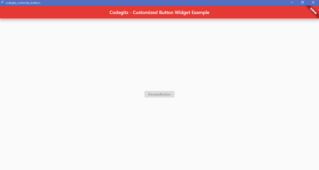
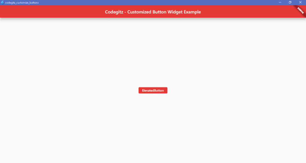
Before we begin here is the code snippet to render an AppBar and ElevatedButton widget.
import 'package:flutter/material.dart';

void main() {
  runApp(MaterialApp(
    home: HomePage(),
  ));
}

class HomePage extends StatelessWidget{
  const HomePage({super.key});

  @override
  Widget build(BuildContext context){
    return Scaffold(
      appBar: AppBar(
      title: Text('Codegitz - Customized Button Widget Example'),
      centerTitle: true,
      elevation: 10,
      backgroundColor: Colors.red[600],
      ),
      body: Center(
        child: ElevatedButtonWidget(),
      ),
    );
  }
}

class ElevatedButtonWidget extends StatelessWidget{
  @override
  Widget build(BuildContext context){
    return ElevatedButton(onPressed: null,
    child: Text('ElevatedButton'),
    );
  }
}
Changing the style property in ElevatedButtonWidget class
Now coming back to the ElevatedButtonWidget class add the following lines of code to the style attribute so the class is modified to look like this.
class ElevatedButtonWidget extends StatelessWidget{
  @override
  Widget build(BuildContext context){
    return ElevatedButton(onPressed: null,
    child: Text('ElevatedButton'),
    style: ButtonStyle(
      backgroundColor: MaterialStateProperty.all(Colors.red[600]),
      foregroundColor: MaterialStateProperty.all(Colors.white),
    )
    );
  }
}
OutlinedButton
The same thing needs to be done with OutlinedButton
class OutlinedButtonWidget extends StatelessWidget{
  @override
  Widget build(BuildContext context){
    return OutlinedButton(onPressed: null,
    child: Text('OutlinedButton'),
    style: ButtonStyle(
      backgroundColor: MaterialStateProperty.all(Colors.blue[600]),
      foregroundColor: MaterialStateProperty.all(Colors.white),
    )
    );
  }
}

Conclusion
We learned how to style the button using ButtonStyle widget by employing the use of MaterialStateProperty.all(Colors). For more content like this visit the Flutter Archives.
For source code visit my Github Repository.