Introduction
How To Style Datatable in Flutter? You’re building an app in Flutter everything looks well and good, but now you’ve added the Datatable widget to your UI, so what’s the issue? You’re seeking solutions for styling or decorating the datatable, but there aren’t any sophisticated options. But don’t worry, this blog post aims to help you resolve that very problem at hand. So without any further delay, let us get straight down to business.
🎨 Create The Theme For The Datatable
Create The Theme File
- First create the theme file that will contain all the styling options for the datatable. Name the file anything for your convenience but for the sake of simplicity let us name it
datatable_theme_example.dart - Now copy and paste the following code snippet inside the
datatable_theme_example.dartfile
import 'package:flutter/material.dart';

ThemeData dataTableTheme() {
  return ThemeData(
    useMaterial3: true,
    dataTableTheme: DataTableThemeData(
      decoration: BoxDecoration(
        border: Border.all(),
        borderRadius: BorderRadius.circular(8.0),
      ),
      dividerThickness: 1,
      dataRowMinHeight: 40,
      dataRowMaxHeight: 50,
      headingRowHeight: 40,
      headingTextStyle: const TextStyle(
        color: Colors.black54,
        fontSize: 16,
        fontWeight: FontWeight.bold,
      ),
      dataTextStyle: const TextStyle(
        color: Colors.black,
        fontSize: 16,
      ),
    ),
  );
}
Explanation
Most of the above code is self-explanatory, but regardless, let us go over some of the properties and see what they actually do.
useMaterial3: Material refers to Flutter framework’s design system guidelines. Material3 is the latest version, setting this flag to true enables Material3 design for your application.dataTableTheme: Once again self-explanatory, this is the property that will enable us to style our datatable, and it takes the appropriately named DataTableThemeData object as input parameter.decoration: This property is used to style our datatable’s background and borders. I used BoxDecoration, but you can use any other decoration.headingTextStyle: This is used to style our header row’s text. Once again, you can modify it according to your needs.- I believe this is enough for introduction, but if you would like to learn more about DataTableThemeData then Flutter has an amazing documentation for DataTableThemeData Class.
🌟 Applying The Theme
Supply The Theme Data To The Application
In the build method of your application’s root widget, provide the name of the theme function to the MaterialApp widget’s theme property. For example,
  @override
  Widget build(BuildContext context) {
    return MaterialApp(
      theme: dataTableTheme(), // <------- This is where you supply your theme
      home: Scaffold(
        body: Padding(
          padding: const EdgeInsets.all(16.0),
          child: Row(
            children: [
              DataTable(
                columns: List.generate(5, (index) {
                  return DataColumn(label: Text("Column $index"));
                }),
                rows: rows,
              )
            ],
          ),
        ),
      ),
    );
  }
🧪 Testing The Theme Data
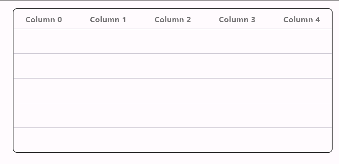
After running my test application with the above theme. This is the final result.
📝 Conclusion
In this post we learned How to style datatable in flutter framework. We didn’t have to use any third party packages or write any boilerplate code. We simply utilized the ThemeData class of Flutter and crafted a theme for our Datatable widget. Keep in mind, this tutorial was only meant to be a starting point for you so you can style your Datatable according to your own specifications. Thank you for reading. If you liked this post, consider visiting the Flutter archives for more.
